Microbrush TRU
DENTAL PACKAGING DESIGN
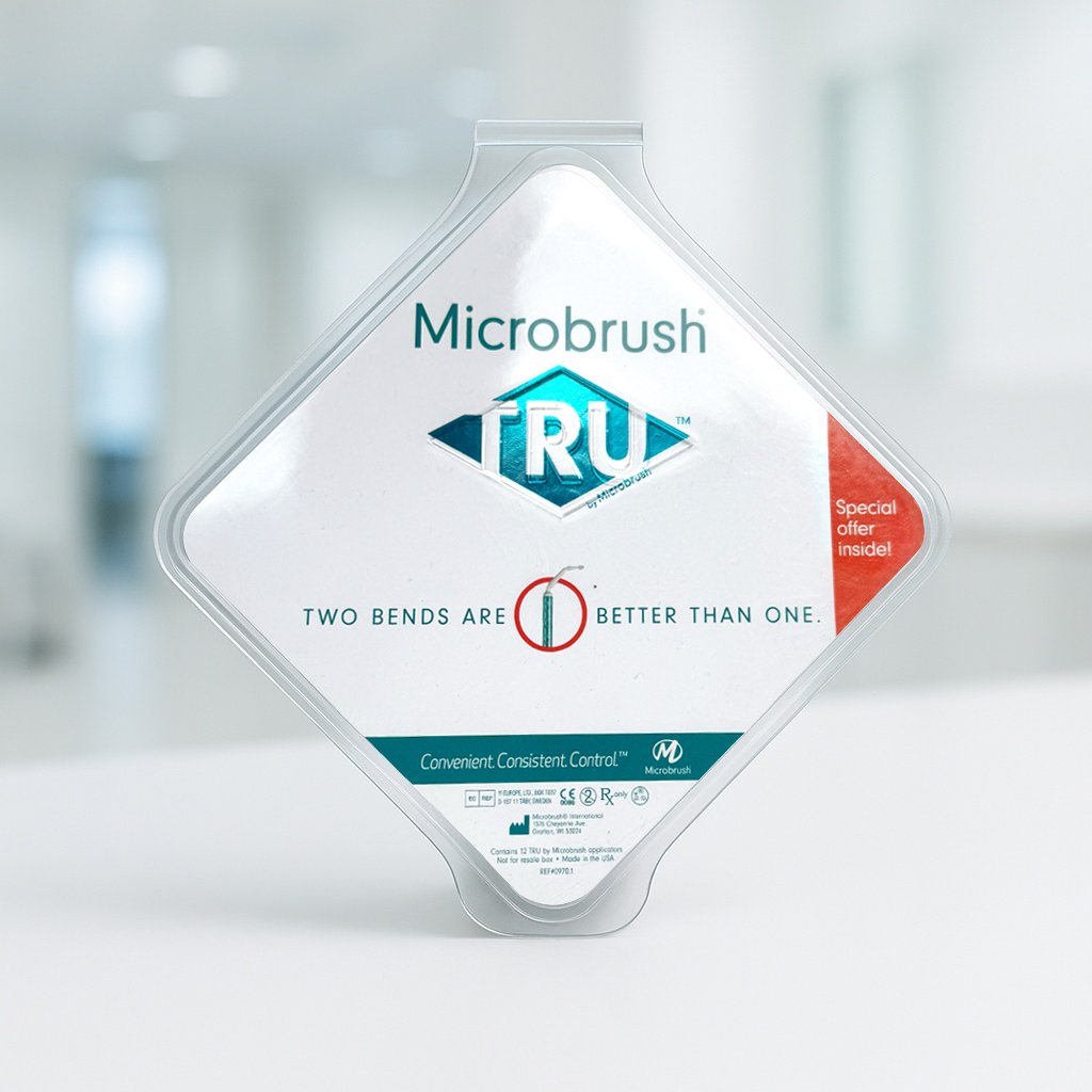
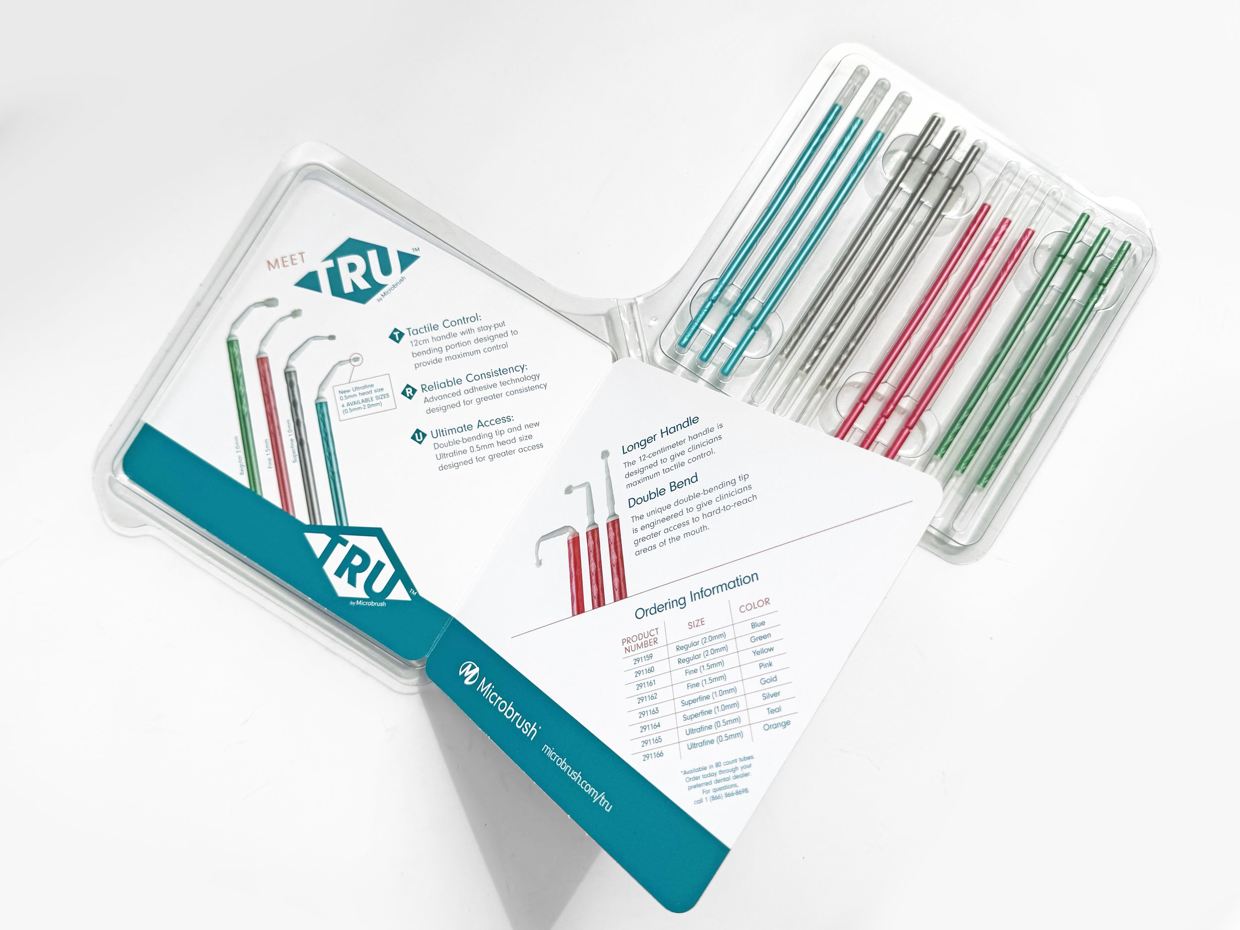
A completely new brand and packaging system were created for Microbrush TRU, centering around an innovative double-bend technology, designed to improve reach and precision in tight areas.
Solution: I switched up the packaging experience by rotating the booklet and TRU logo clamshell embossing 45 degrees to create a distinctive diamond orientation - mirroring the brand mark. Inside, the product’s two-bend advantage story was highlighted. The insert introduces TRU and solidifies the newly debuting brand: Tactile Control, Reliable Consistency, and Ultimate Access.
The relaunch exceeded expectations, and sales reported a surge in interest, with external customers responding overwhelmingly positively. Early sell-through increased by approximately 22%, driven by clear product differentiation and a strong visibility.
Valspar
WOOD CARE LABEL PACKAGING REDESIGN
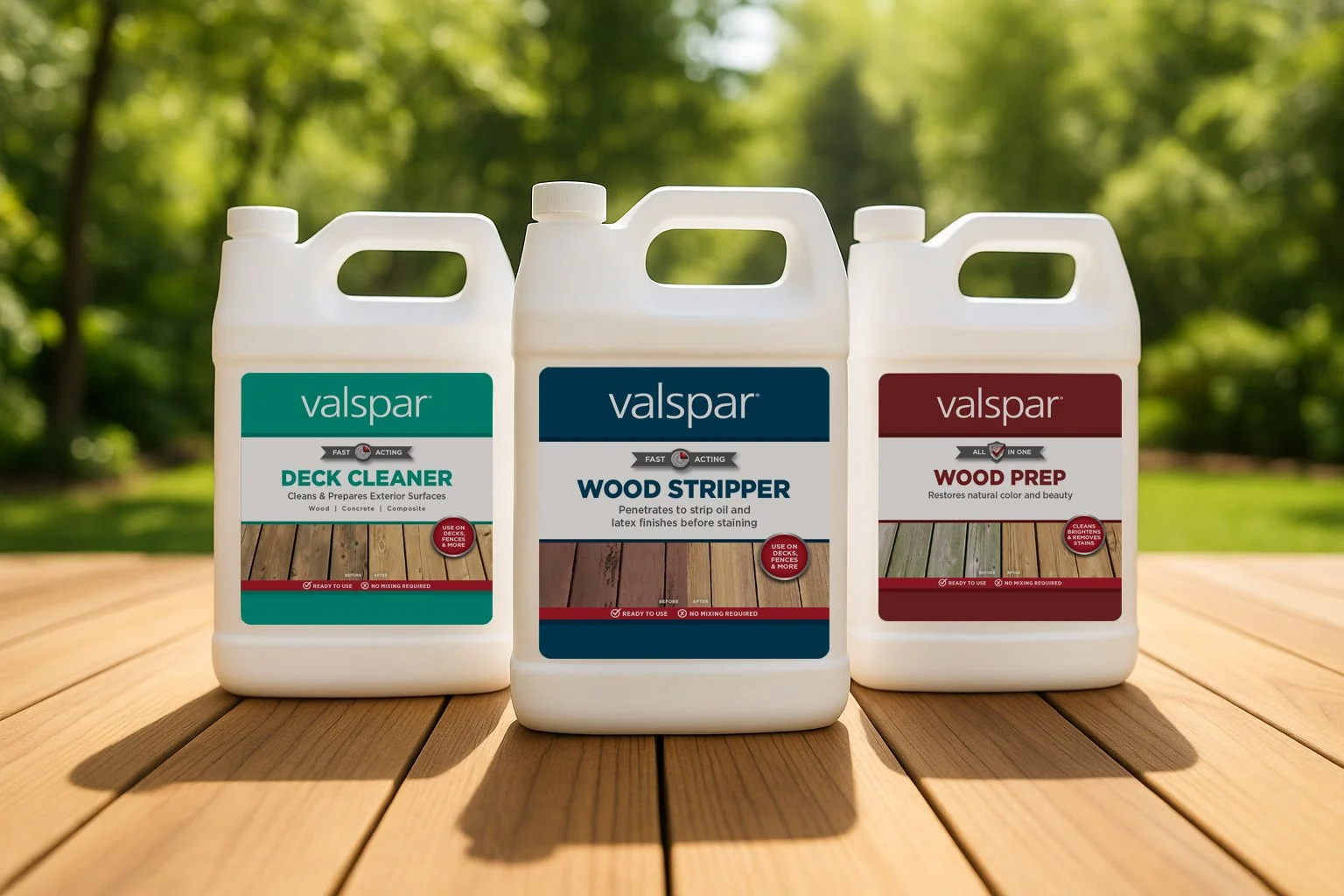
A refreshed wood care line with a modern aesthetic was requested to align with revised branding and to increase retail performance. The goal was to simplify the label while retaining brand familiarity. In order to refresh the line while preserving familiarity, the existing color palette remained, and a strong hierarchy featuring a new callout banner treatment was introduced. The refreshed packaging system marked a cohesive presence, delivering a stronger shelf impact aligning with consumer needs.
Omron Healthcare
MEDICAL PACKAGING REFRESH AND REBRAND
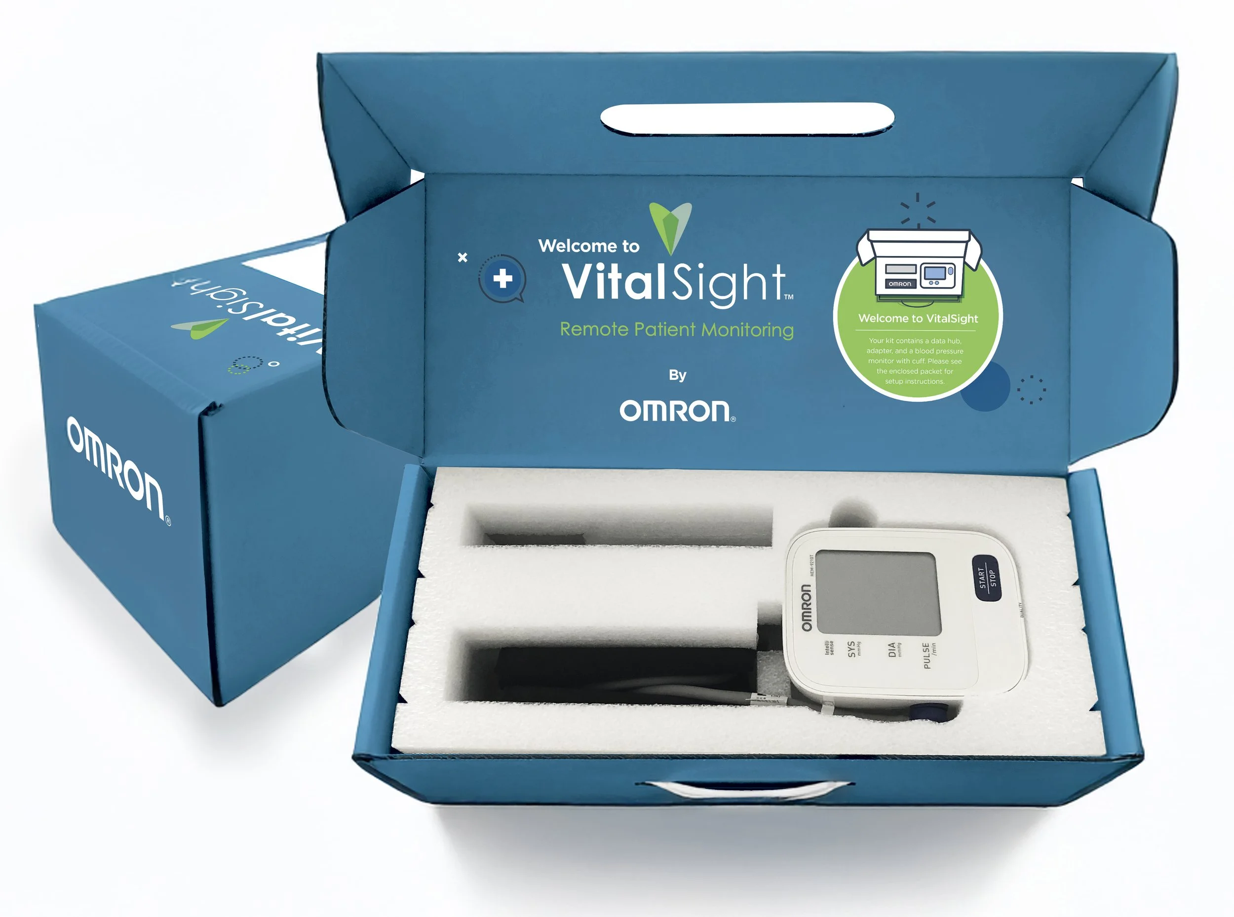
I reimagined and reconfigured a remote patient monitoring kit to align with updated branding, and create an intuitive home health experience. There was a heavy influence on simplicity as most patients tend to abandon a doctor-requested home program if instructions are unclear.
An approachable packaging system was introduced to reflect new global branding. Large print, concise instructions guided users through initial setup of the blood pressure monitor and data hub, ensuring seamless real-time transmission of readings to the patient’s clinician. The streamlined packaging offers a cost-effective and user-friendly solution. This redesign reduced production and shipping costs by nearly 70%. The kit empowered patients to share health data with their clinician, supporting better monitoring and health outcomes.
Walmart
GREAT VALUE BILINGUAL PACKAGING DESIGN | ILLUSTRATION
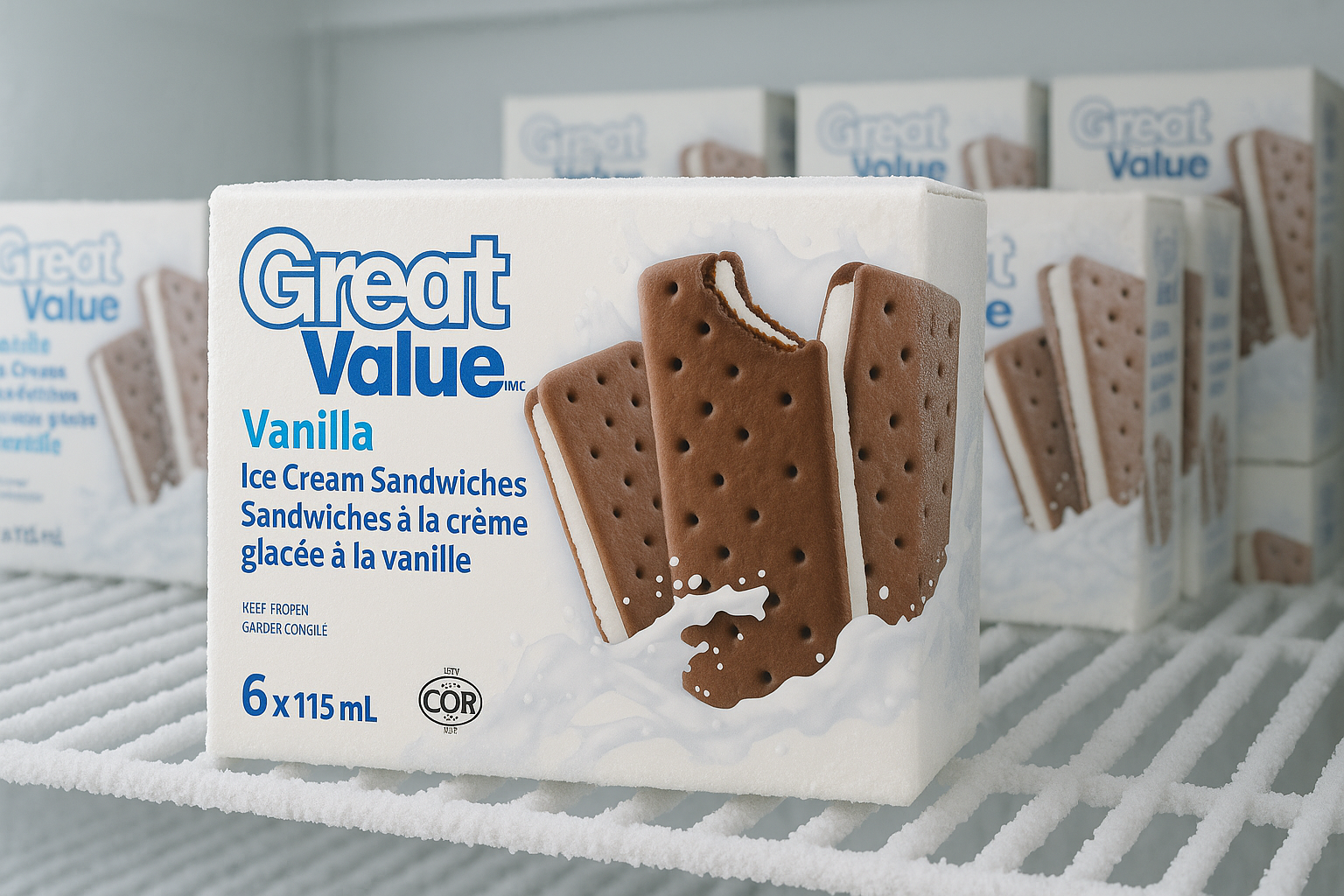
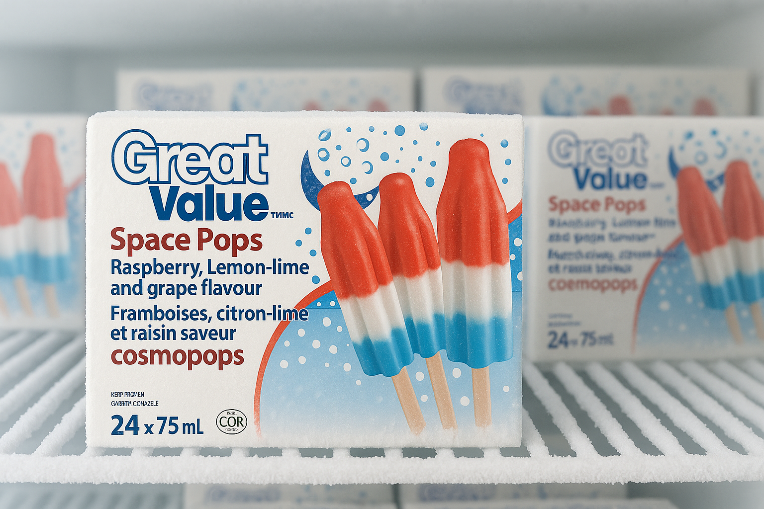
The challenge was to design frozen packaging aligning with the Great Value rebranding while continuing to stand out on shelf. As this was for the Canadian market, packaging was bilingual with equal prominence to English and French.
Whimsical illustrations and dynamic product photography made this line feel fun and approachable. The final designs support the refreshed branding while clearly communicating product and flavor cues that align successfully within the frozen dessert category.
Valspar
LOWE’S IN-STORE DISPLAY DESIGN

The project was to create an educational in-store display for Lowe’s customers to understand the importance of wood prep prior to staining and guide them to the ideal stain for their DIY project.
The layout was data heavy, requiring a welcoming space for shoppers to easily engage. Key product stages were broken out, and a QR code was added as a quick vehicle to show consumers the full stain color and transparency range. The prototype clearly communicates the Valspar prep messaging while simplifying product selection for DIY’ers. This display supports in-store navigation as well as the broader product selection experience.
Walmart
BILINGUAL PACKAGING DESIGN | ILLUSTRATION
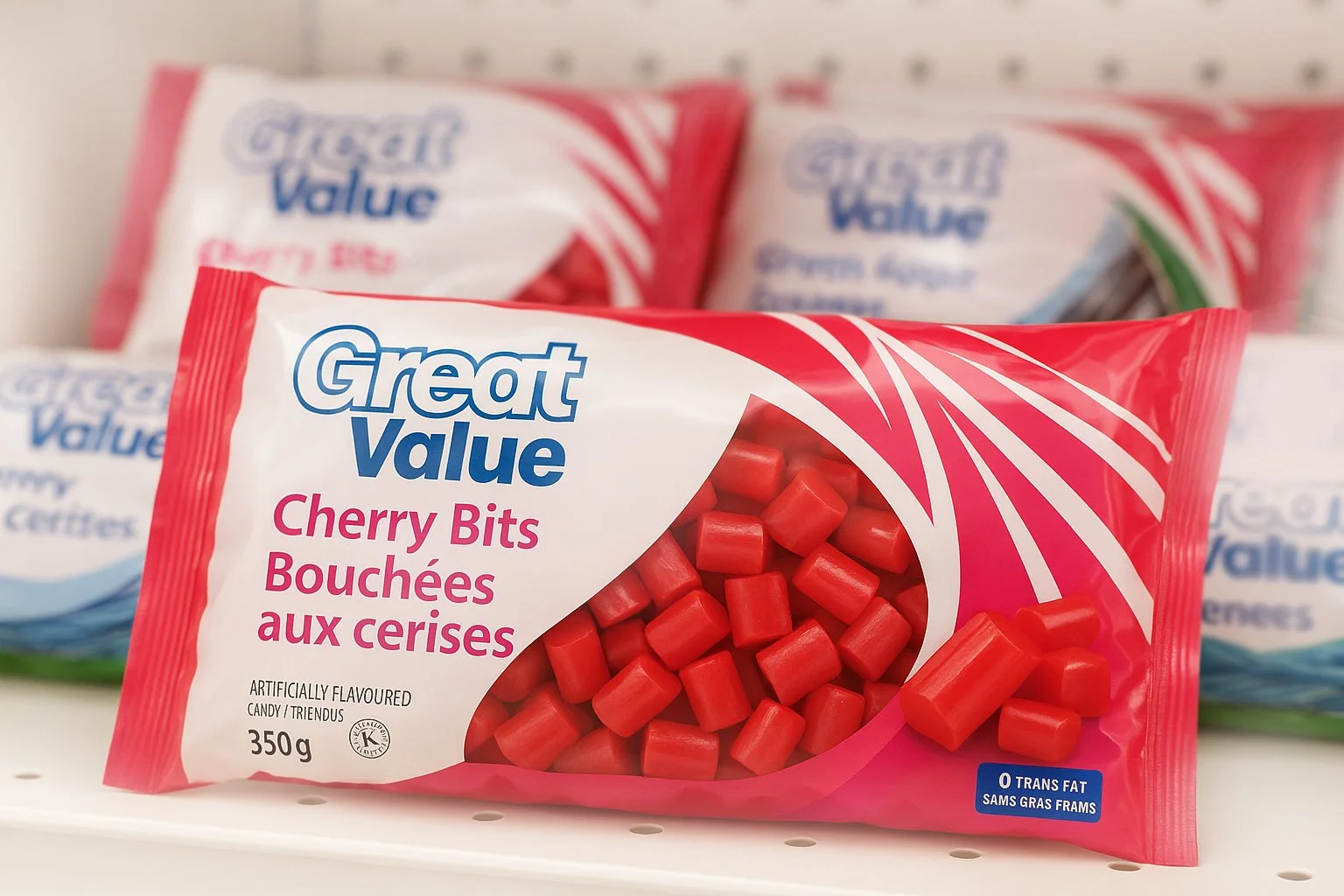
The licorice family required a refresh for the Canadian market as part of a rebrand effort. The design required improved shelf prominence while meeting bilingual requirements regarding equal emphasis on the English and French language.
A bright flavor-coded palette and an integrated product window elevated impact. The final package family provides easy color cue separation while delivering on visibility, brand consistency and bilingual accessibility.