Omron Automation
FULL PAGE PRINT AD DESIGN | CES PRODUCT LAUNCH KIT
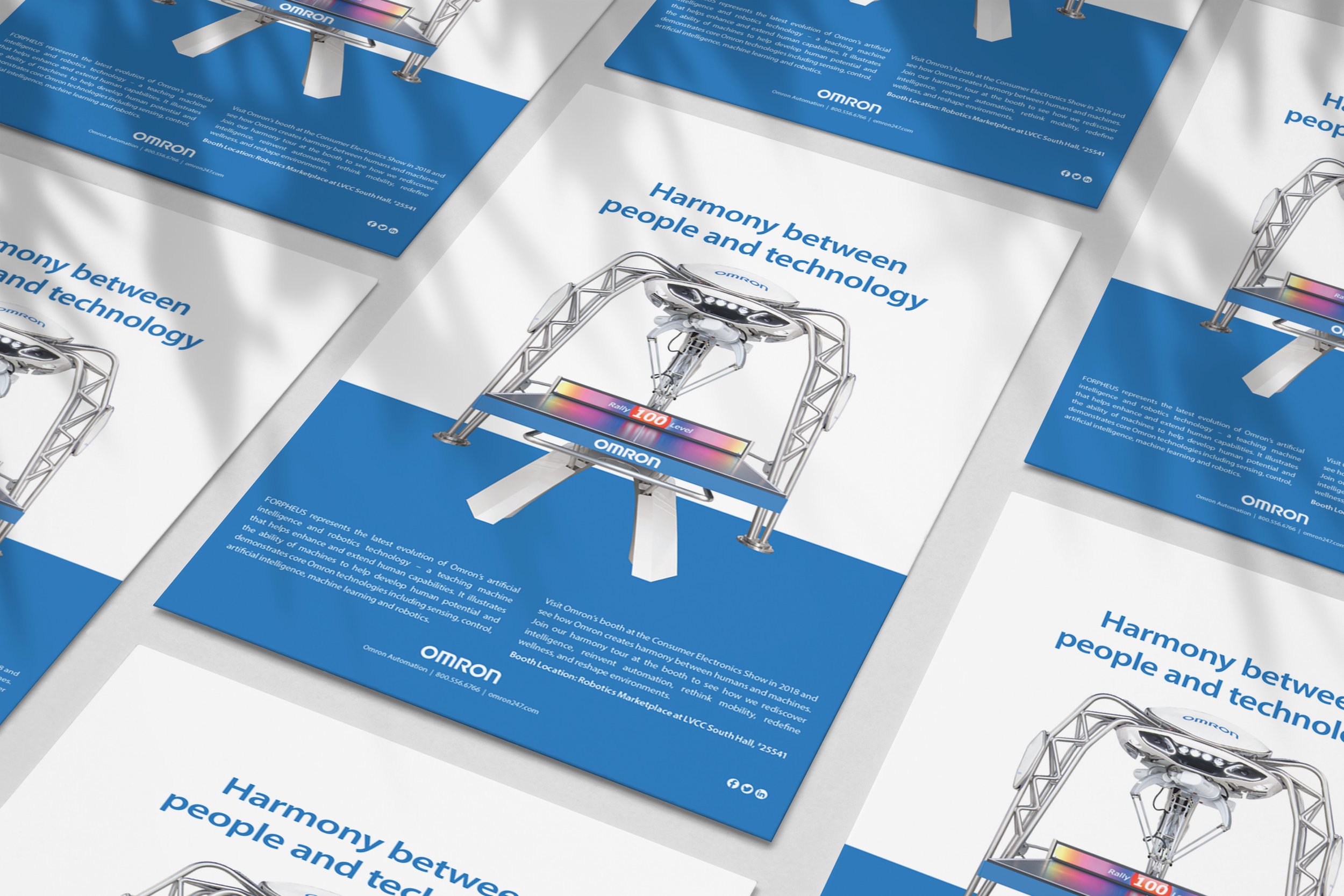
Omron’s AI-powered ping-pong robot, Forpheus, debuted at CES with this full-page print ad and launch kit that showcased the harmony between robotics and machine vision. The concept highlighted Forpheus’s advanced capabilities, including tracking a ping-pong ball 80 times per second, predicting smashes, and reading player emotion to create a more personalized experience.
The clean, minimal layout placed the robot at center stage and supported Omron’s broader innovation story. The CES activation exceeded expectations, generating 111 media features and 3.8 billion earned media impressions, which was 2,000 percent above the original target.
TRU by Microbrush
BRAND IDENTITY | LOGO DESIGN | SELL SHEET DESIGN
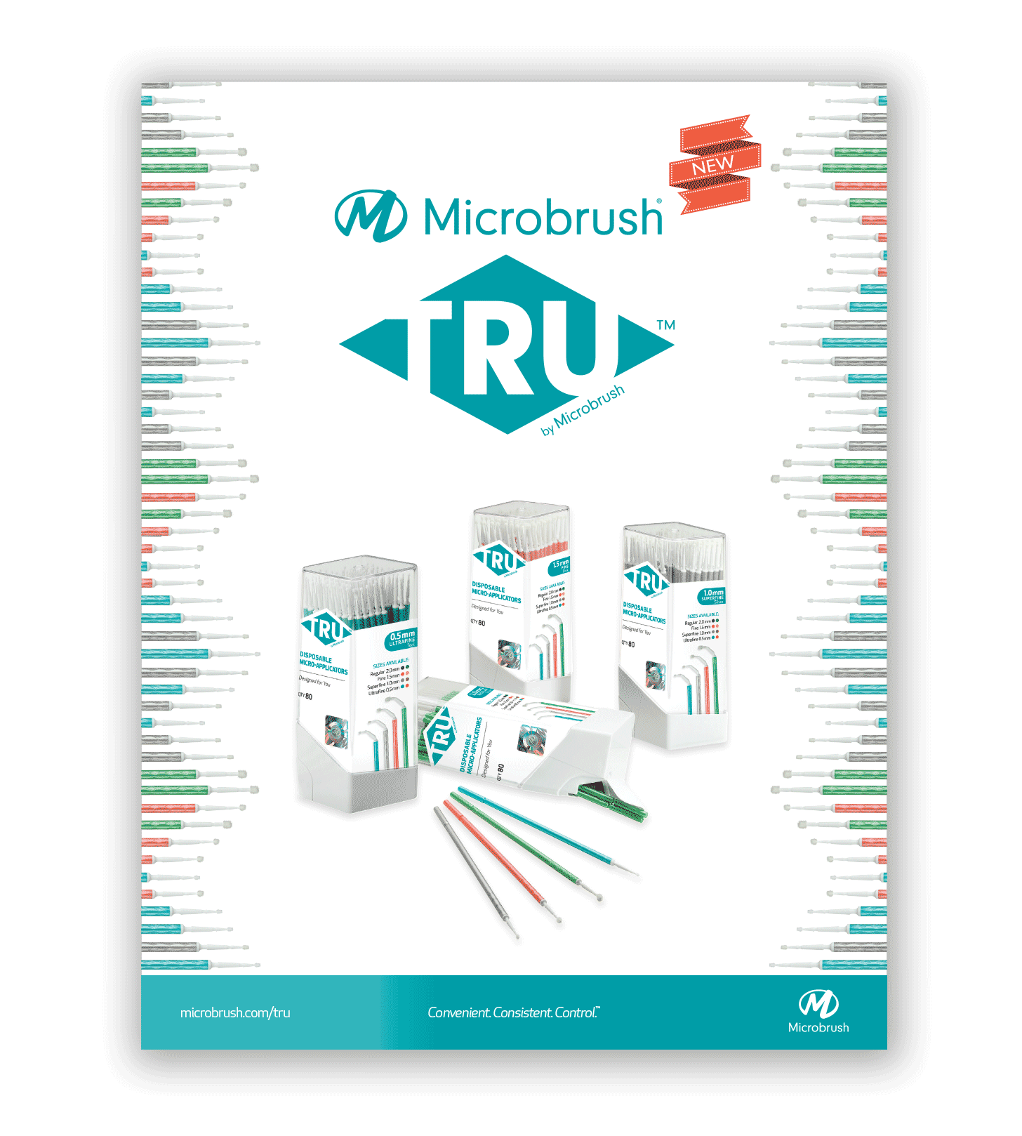
The challenge was to introduce a premium new brand of multi-bend applicators to dental clinicians. Under the Microbrush umbrella, TRU™ represented a break from a 30+ year legacy and required a full modernization of the brand. I developed the complete identity system, including the logo, color palette, packaging, and typography, along with a styleguide to guide all marketing communications.
The final design system positioned TRU™ as a high-performance, versatile applicator with a bright, modern aesthetic. The launch response was overwhelmingly positive, resulting in a 24 percent lift in early sales and rapid adoption across key clinical accounts.
Cabot Woodcare
PRODUCT LAUNCH SELL SHEET DESIGN
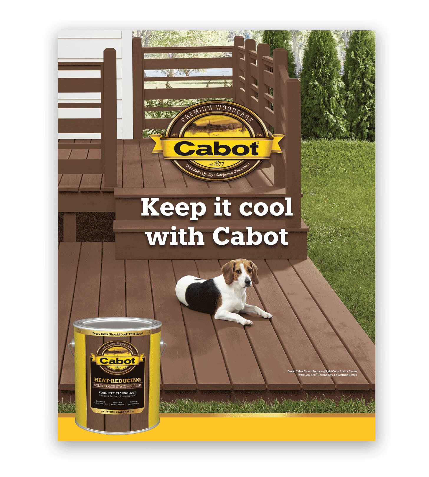
This project introduced Cabot’s Cool Feel technology through a consumer-friendly, lifestyle-driven sell sheet that blended technical data with a warm, approachable visual narrative. The launch supported a 22% uptick in early adoption and strengthened retail positioning across core markets.
Obtura Spartan Endodontics
BRAND IDENTITY | LOGO DESIGN | COPYWRITING | SELL SHEET DESIGN
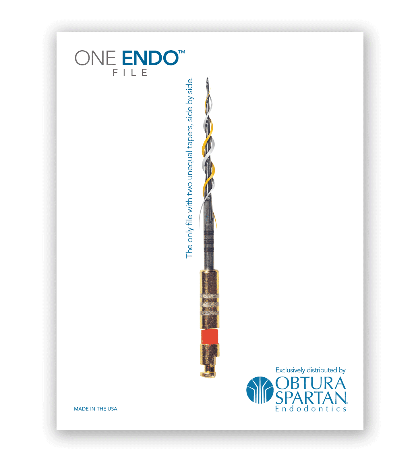
The challenge was to introduce a new, highly innovative endo file to the dental market and reinforce trust with endodontists. The concept centered on a clean, minimal aesthetic with the product enlarged for maximum detail. Spot gloss varnish on soft-touch stock added a premium, tactile layer while the reverse side delivered a clear technical story with specs, diagrams, and competitive differentiators.
The final piece positioned ONE ENDO as a strong, premium solution with both visual impact and scientific credibility. It outperformed sales projections and drove a 28% increase in recurring orders, exceeding the launch goal.
D-Lish
BRAND IDENTITY | PRODUCT POSTCARD DESIGN
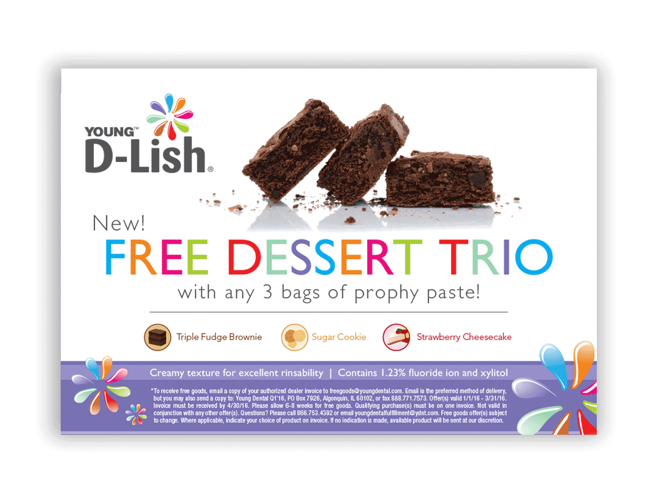
The D-Lish dental varnish rebrand goal was to feel more fun and engaging highlighting a new dessert flavor variety. I led a full refresh, including branding, sample and traditional packaging. Flavor cues and a new typography execution captured a whimsy take. The revised look brought an even stronger shelf presence and brand recognition, increasing sales by 33% with supporting print materials and sample packs sent to hygienists and dentists.
Omron Automation
PRODUCT AND SOLUTIONS CATALOG DESIGN
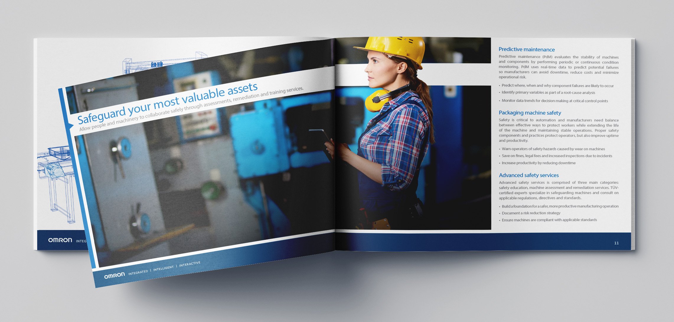
Challenge Create a safety components piece offering safety service solutions. Historically, there was an emphasis on products, so this was a departure from the traditional strategy. The piece will also highlight solution-oriented products and an associated value to ensure an efficient manufacturing line with reduced downtime.
Solution The catalog followed a landscape format as a stand-alone piece (separating this from existing collateral). Blueprint illustrations layered behind photography gave a nod to engineering precision while reinforcing Omron’s innovation. The layout balanced tech with human-centered storytelling to keep it relatable and engaging.
Result The piece created a measurable buzz among internal stakeholders and consumers. The full value of Omron’s safety offerings were successfully represented, generating a 44% increase in new customer meetings the first quarter it released.
The Metropolitan Museum of Art
SEASONAL CATALOG REDESIGN
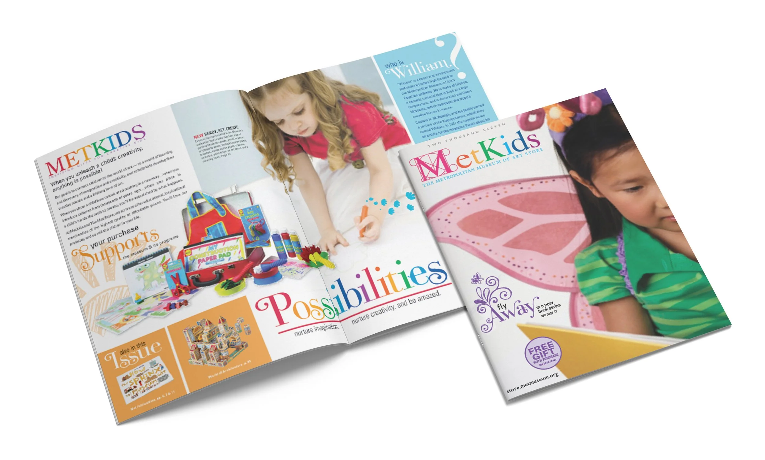
This seasonal catalog for The Met’s children’s collection was designed to feel imaginative, playful, and rooted in the joy of creativity. I blended hand-drawn elements with colorful typography to evoke a childlike sense of wonder while using lifestyle photography to ground the products in real-world use. The visual approach balanced illustration, storytelling, and product clarity to appeal to both kids and parents.
The final piece delivered a vibrant, engaging voice for the MetKids brand and inspired exploration and creativity. The refreshed look strengthened product appeal and contributed to higher engagement with featured items, with a measurable lift in parent-driven purchases during the season.
Follett
CATALOG CONCEPT | VARIABLE DATA PRINT STRATEGY | MULTI-SCHOOL CUSTOM CATALOG DESIGN
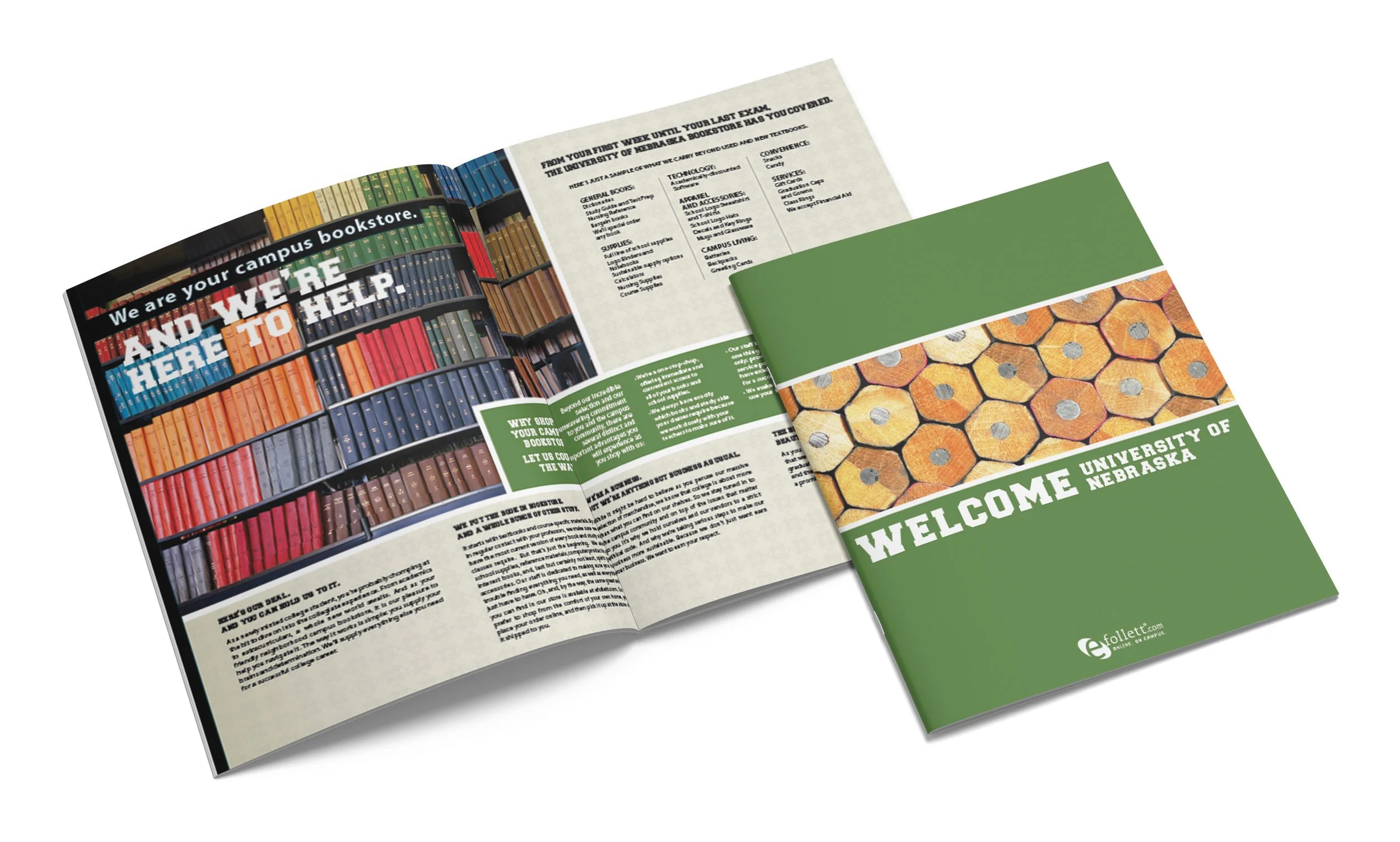
This project involved creating a flexible, customizable catalog system for more than 120 universities, each with distinct branding and bookstore offerings. I developed a modular template structure that supported variable data, school-specific inventory, and dynamic color adjustments tailored to each university’s identity. The system allowed every catalog to feel unique while remaining scalable, consistent, and easy for teams to update.
The final solution gave Follett a streamlined approach to producing large volumes of personalized catalogs for campus bookstores across the country. The improved clarity and relevance helped increase engagement and contributed to a 22% increase in purchases at the bookstore on average with among incoming students.
Schwan’s Home Delivery
FAMILY ENGAGEMENT CAMPAIGN AND QUARTERLY CATALOG DESIGN

The challenge was to strengthen family engagement and highlight Schwan’s as a convenient, kid-friendly meal solution. Parents were looking for easier ways to plan meals and involve their kids in cooking, so the catalog needed a clearer structure and a more inviting tone. The solution paired customer testimonials with family-focused recipes and tips. A color-coded layout system organized recipes by type and made the large catalog easier to navigate. The refreshed design added warmth, clarity, and stronger storytelling throughout. The updated system increased recipe interaction and contributed to a 15 percent lift in featured product sales during the campaign period.